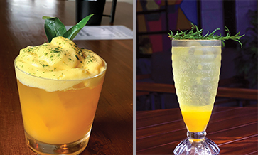


With every year comes a new opportunity for designers to push their limits and set excellent packaging design trends. From aesthetics to colours to illustrations to bringing out exceptionally new designs, everything is curated with an absolute eye to detail.
One such packaging design is Retro-Futurism. It is considered to surprise us with a whole new era to packaging. Let’s move ahead by taking a deep dive into the concept of Retro-Futurism packaging designs and how it has profited brands so far.
Retro-futurism is typically a design theme that can evoke truly heartfelt nostalgia and also make the mind think about what the future is going to bring. It is a common belief that the designers of 2020 will make the most of this approach by picking up modern trends and using them to recreate remarkable designs that also reflect the retro elements.
This shall serve as the most profitable way to appeal to wide variety consumers. But what does it include? It is a combination of neon colours, bold gradients and retro design touches (like minimalist logos and retro-inspired typography) to come together in unique, unexpected, and on-trend ways.
It will also make way for a highly competitive environment among brands. Understanding this natural longing for the past, many brands have left behind the modern aesthetics in favour of sporting a deliciously retro design.
Listed below are a few brands that have already adopted this trend and are making the most of it. Now enjoy the fine and fabulous style of the bygone eras by taking a leisurely scroll down this article.
VooBrew
It is mostly assumed that beer brands originally only have their labels to separate themselves from the competing beverages on the shelf. However, VooBrew packaging has been executed in such a way that avoids the use of the typical long-necked bottle, swapping it out for another silhouette.
The ale and lager have been funneled into small stubby jars that make them look more like eclectic moonshine flasks. The labels have been printed on hand-cut white stickers marked with thick black letters, and with the embellishment of an additional dye each, giving them a vintage homespun approach.
Dewar’s blended Scotch
The bottles seem to have an authentic Scottish heritage look. The top of the product is perfectly touted, like true Scotch. The distinct characteristics of the bottle speak about a tale from an old Scottish farmhouse where Scotch used to be truly made.
Additionally, the oak casket shaped base of the bottle narrates its old age. It’s nostalgic feel and yet-to-come futuristic way of packaging makes it a perfect example of seamlessly put together Retro-Futuristic packaging.
New World wines
The packaging of New World wines highlights the various kinds of limited edition wines from across the globe. The unordinary idea behind this package was to bring out the ancient rituals from each of these regions of the world.
It thus makes the ethnic masks, with bold and gradient neon colours, a symbol of age-old ceremonial rituals. The colourful masks represent the distinct personality of each of these wines.
Mentioned above are just a few examples of the alcobev industry that have adopted this approach. Nonetheless, there are many more to come, and 2020 is all set to pave the way for them.